"A logo with a story"
- If you want to create a strong logo, you need to be clear on your company foundation.
The link between the company and the customers
The logo is the heart of the company's visual identify. It is the symbol that should make recognize you from.
Therefore it is important that your logo...
. Tells the story you want it to tell
. Have the identity you want to recognized from
. Is simple and easy to recognize
Elements defines your story
You can use different visual elements to tell your story. Colors, shapes, fonts has a big impact on how your logo is decoaded by your target group. Every visual element brings up thoughts in your customers mindes. What kinds of thoughts depends on their experiences through life, what culture they live in, their age and ect. Therefore it is important to know who your customer is, in order to be able to tell them the right story with the right visual elements.
Make people wonder
If you can make people wonder, the chances to make the remember you is bigger. It is okay, that people doesn't understand your logo within the first 2 seconds. When you invite them to wonder what your logo means, you involve them.
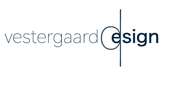
CASE: Vesteergaard-design logo
Let me come with an example. When I Designed my own logo, I wanted it to show my DNA. To me, design is a challenge to find the balance between:
. Users, suppliers and company
. Aesthetics, functionality and ressources
. Innovation, creativity and usability
From the DNA, the creative process began. I came up with different puposals, and got feedback from people. I asked them what they through when they saw the logo. The only way to know if the solution shows what you want, is to get feedback from your target group.
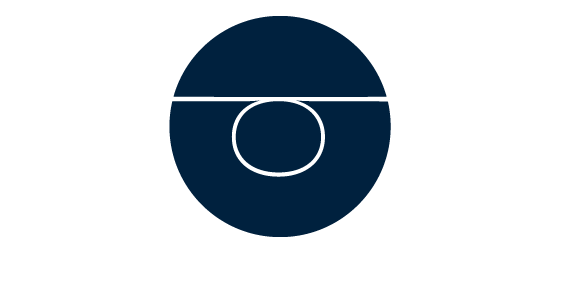
The result
This is the result. It symbolises a weight in balance - like the perfect design in balance. It is a little principle, which means that people can wonder what it really is. When you make people wonder, it makes the chance of them remembering you bigger.
The d in "vestergaard design" is the weight twisted around. It symbolises the creativity, and the proces towards the goal. In the blue circle, symbolising the final design in balance.
The dark blue color was chosen because I want to create a trusting relation with my clients. And my designs should be creative and realisable at the same time. The blue color is a calm and trustworthy color, therefore it helps me to create symbolize the kind of relation I think is important to have between me and clients.
Thank you for reading. I hope you find it useful and inspiring.
//Josefine Vestergaard